
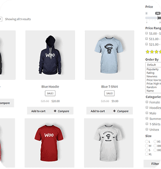
Not all customers shop from the same device, some use mobile, and other shop from laptops or desktop screens, each with different dimensions.
One of the most important things to ensure is that all popups appear consistently and correctly across all devices. A popup that looks perfect on a desktop but gets cut on mobile creates a gap in your store that can costs you significant sales every day.
That’s why WBW Products Quick View Modal for WooCommerce includes Responsive on All Devices feature, ensuring your popups appear consistently on all devices.
What is the Responsive on All Devices Feature
This feature ensures that the quick view popup adapts smoothly to desktop screens, laptops, and mobile devices without any layout issue or broken elements.
Which maintain consistent functionality across every device so customer can browse, select variations, and add to cart with equal ease wherever they are. Whether they quickly checking your store on their mobile phones, or browsing on a tablet from their couch, they will see the same popups and expereince through all devices.
Why it Matters
- Consistent Useability
With this feature all shoppers can browse product and all details, then add it to the cart easily, regardless of device.
- Better User Experience
When you ensure that your store and the popup appear in the same way and look with all devices and can be used easily, this provides the best experience for your customers, which lead to increase in conversion rate.
- Most of your Customers Are on Mobile
The majority of your customer today brows and buy from their mobile phones. So, if the quick view feature is not optimized for mobiles, is not just a loo of sales, it is actively turning a way the largest segment of your audience before they ever reach checkout.
Who Benefits From this Feature
- Store Owners with a Diverse Audience
If you are selling to a large and diverse audience with varied business and backgrounds, having a quick view experience that works equally well for all of them is not optional, is essential, and this is exactly what this feature offers you, that ensures no customer is left with a broken or frustrating experience.
- Agencies & Freelancers
One of the most important things that clients test after a store goes live is a “responsiveness” If their store design and popups don’t adapt to all devices, this is considered a major problem.
- Growing eCommerce Store
As your store grows every day and attract more customers, the verity of devices your customers use will only increase, so having a quick view that adapt with all devices is essential.