
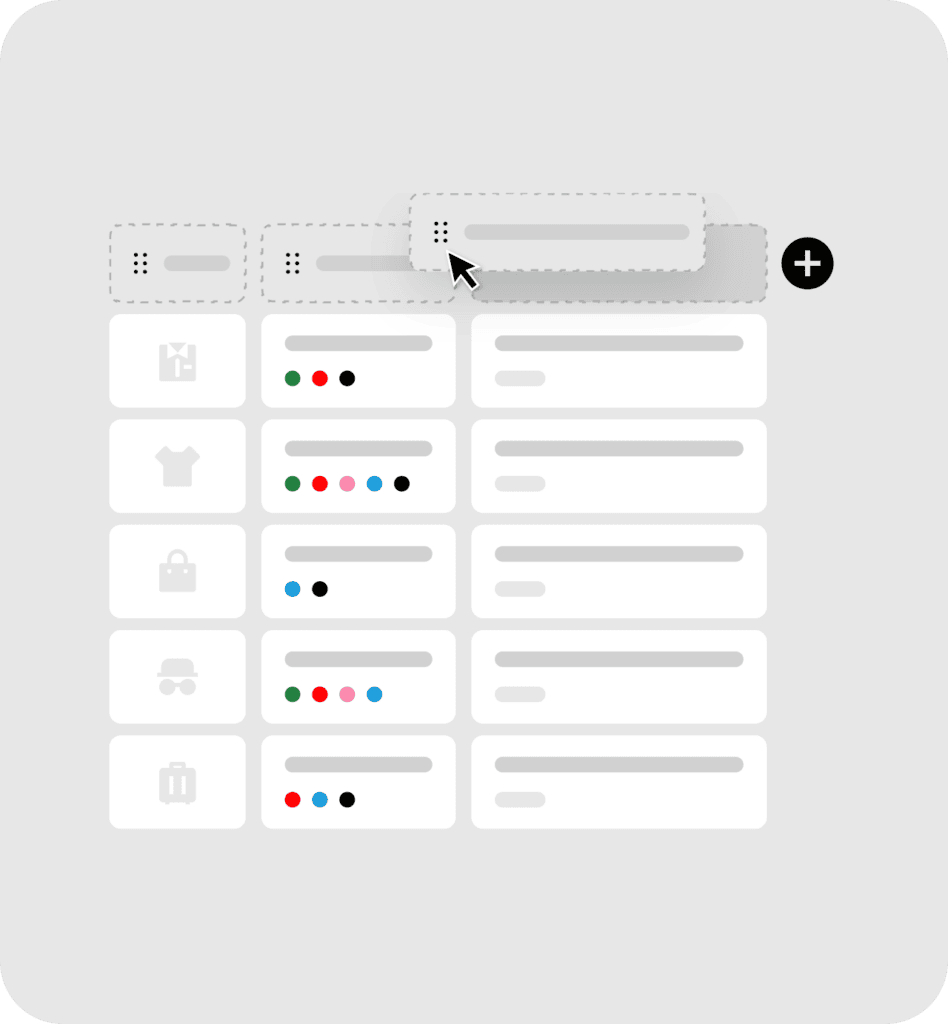
Customers don’t shop from just one device, some use laptop or tablets, while others shop on mobile, and with more half of all online shopping happening on mobile devices today, a comparison experience that isn’t fully optimized for smellers screens can feel broken, cluttered, and frustrating for the majority of your customers.
That’s why it’s essential to ensure your comparison table is clear and fully functional across all devices. This is exactly what WooCommerce Product Comparison delivers its Responsive & Mobile Friendly feature.
What is the Responsive & Mobile Friendly
This feature ensures that your comparison table is fully optimized for all screen sizes, adapting smoothly to desktop, tablet, and mobile devices.
Which deliver a consistent and polished comparison experience to every customer regardless of the device they are using.
Why It Matters
- Consistent Experience Across All Devices
With this feature you ensure all your customers can compare products on any screen without layout issues or broken content.
- Better Usability on Mobile
As we mentioned previously, more than half of all online shopping happens on mobile devices today. So, improving the shopping experience and comparison tables on mobile devices is not an optional toady, is essential.
- No Extra Setup Needed
Previously, designing a product comparison table work properly across different screen sizes required custom CSS, developer adjustments, and ongoing maintenance, but now full responsiveness is built in from the start and works perfectly out of the box on every device without extra configuration.
Who Benefits from This Feature
- Stores with a Mobile First Audience
Some stores their primary audience coming from mobile devices, so if you have a problem with the layout of comparison table on mobiles, this is considered a problem because you are almost losing all your sales. This feature ensures that every mobile shopper gets the same polished comparison experience as a desktop or tablet user.
- Agencies & Freelancers
Delivering stores that look professional across all devices for your clients, it is one of the things that cannot be dispensed with. So, this feature ensures that the comparison tables never become a source of layout complaints or usability issues after launch.
- Growing eCommerce Stores
Newly emerging stores that are growing and expanding, most of their audience coming from mobile devices, so this feature ensures for them having a comparison feature that is built to be fully responsiveness.