
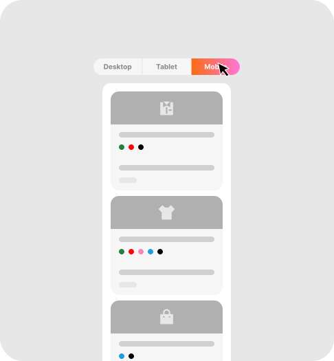
Today customers move between multiple devices, from phones to iPad to laptop. So, if your product table doesn’t adapt smoothly, you risk losing potential customers. With Responsive on All Devices, your product table looks sharp and works flawlessly everywhere.
What is Responsive on All Devices
This feature ensures that your product table automatically adjusts to different screen sizes like:
- Mobile phones
- Tablets
- Laptops
- Desktop screens
This feature ensures that your table stays clean, organized, and easy to navigate on all screens, regardless of their sizes.
Why it Matters
- Shopping though mobiles
A large percentage of customers browse and buy on mobile devices.
- Better user experience
No zooming, no horizontal scrolling, no broken layouts.
- High conversions
A smooth experience across all devices increases the likehood of completing purchase
Who Benefits from this Feature?
- Stoer owners: Consistent design and performance across all devices.
- Mobile shoppers: Easy browsing and ordering without frustration.