We have all the necessary options in one plugin. You can start to try them now, following this clarification.
Popup Notification plugin contains 3 main tabs:
Design
In the Design, there are 3 tabs: Templates, View Styles, Custom CSS.
Templates
Here you can choose a template from the list. Search by name or tag.
![]()
In the left panel, you can see the template construction: blocks with text and display rules. The base template includes 1 rule to display and 2 blocks of text.
View Styles
View styles come with settings for popup style: you are able to change the position on page, background, borders, text, close button.
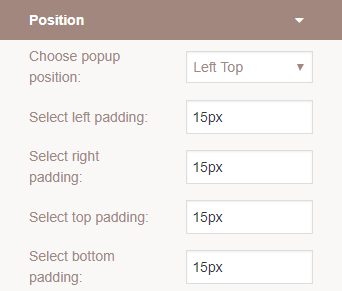 Position
Choose the position on the page – left (bottom, middle, top) centre(bottom, middle, top), right (bottom, middle, top)
Select the padding for any side in px.
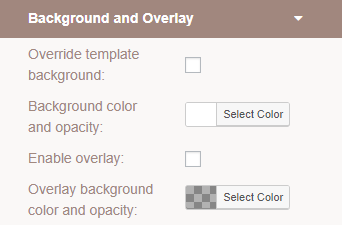 Background and overlay
Enable Override template background and pick the colour and transparency for a background.
Enable overlay and pick the colour and transparency for overlay.
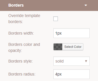 Borders
Enable Override template borders to change:
- Borders width in px
- Borders colour and opacity
- Borders style
- Borders radius in px
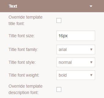 Text
Text
Enable Override template title or/and description font to change:
- Title font size in px
- Title font-family
- Title font style
- Title font-weight
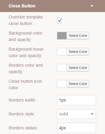
Close button
Enable Override template close button to change:
- Background colour and opacity for button
- Background colour and opacity for a button on-hover effect
- Borders colour and opacity
- Close button icon colour
- Borders width in px
- Borders style and radius
Custom CSS
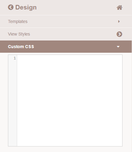
If you have basic knowledge of CSS – you can use the CSS Editor to change the appearance of the table. Simply type styles for popup elements in the editor window.
Don’t forget to press “Save”
Content
In the Content section, there are 2 tabs: Text and Text rules. Here you can create, duplicate and remove custom text for your notification template by using static text and custom text rules.
Text and Text rules
![]()
Text
In the Text Editor add a text you would like to see in a popup. Here are the same settings as in Classic WP Editor – font settings, align, link insert, list etc. Also, you are able to add Media.
To display variations like numbers, locations, WooCommerce data you can add a shortcode with a text rule. Additional settings for text design you can find in the Design -> Text.
Text Rules
In order to create a text rule, click on Text Rules. Select a type of rule in the list:
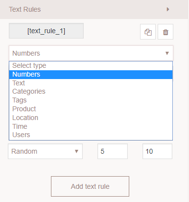
Number. Choose how to display the numbers (f.e a quantity of sold products, how many people bought etc) – random or exact. If you want to display random numbers – specify the diapason of numbers (f.e diapason 5-10 in the popup will be shown as random numbers 5,6,7,8,9,10).
Text. Add a text and conditions to show it – random or one-by-one. If you want to display random text – use the delimiter ~ to separate it.
Categories. Select “custom” to display a category from the list or select “user current category” to display a category of the page that user browsing.
Tags. Select the tag(s) from the list to display.
Products. You can use all products or select some of them and display one by one or randomly.
Location. Here are 2 options: to show visitor city and country or display random nearest cities.
Time. Select the time formate. Here you can display the current time or show a time countdown with a target time.
Users. If you want to use all users name leave the checkboxes empty.
Example: Today [text_rule_1] users bought [text_rule_2] in the [text_rule_3] city.
Rules to display
Display rules parameters will help you determine how and when to display the notification.
- Time on page – popup appear on page depend on the selected time and value.
- Time on site – popup appears on page depend on the time the user spent browsing the website.
- Distance scrolled – popup appears than user scrolling the page, depending on the value in px.
- Visitor inactive time – set the time of visitor inactivity to display a popup.
- The date – set the date to display a popup
- The current time – set the time to display a popup
- The current day – set the day to display a popup
- A visitor is new – popup will be displayed only for new visitors.