
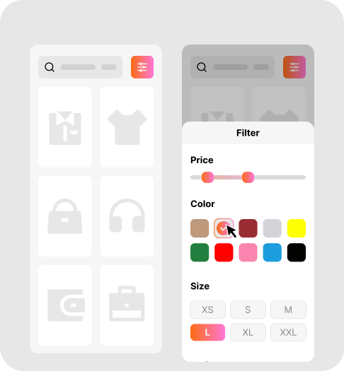
Today, most of our customers are browse and purchase directly from their mobiles. So, if your filters aren’t completable for smaller screens, this will ultimately lead to losing your customers.
That’s why our Filter plugin is Fully Mobile Responsive, ensuring that mobile shopper get the same fast, and smoother filtering experience.
What is Fully Mobile Responsive?
Fully Mobile Responsive means that filters adapt to different screen sizes and devices, from smartphone, to tablet and desktop, offering the same smooth navigation and usability as on laptop, without elements overlapping, breaking the layout, or disappearing on smaller screens.
For more on this, see our guide: Filtering on Mobile Devices: How to Improve UX and Reduce Abandoned Searches.
Why it Matters
- Reduce frustration for mobile users.
- Provide consistent experience across all devices.
- Makes filtering easy on small screens.