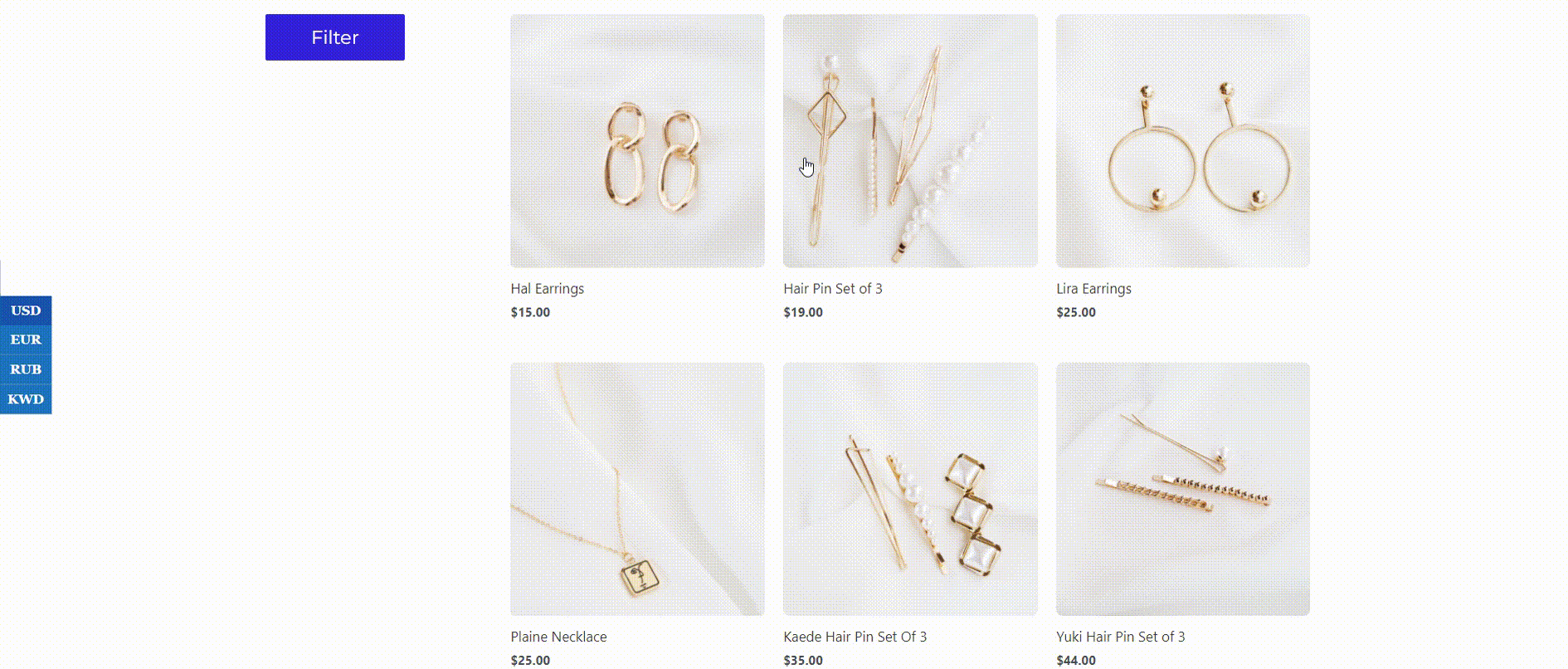
The WooBeWoo Product Filter plugin comes with everything you need to organize filtering for any purpose. For example, you can enable the Floating mod and your filter will appear in the popup. And this tutorial will help you enable and configure the floating mod.
How to enable floating mod?
If you have already created and configured your filter and now you want to make the filter appear in the popup, it’s time to turn on the floating mod.
To do this, go to Design -> Floating Mode and check the “Use Floating Mode” checkbox.
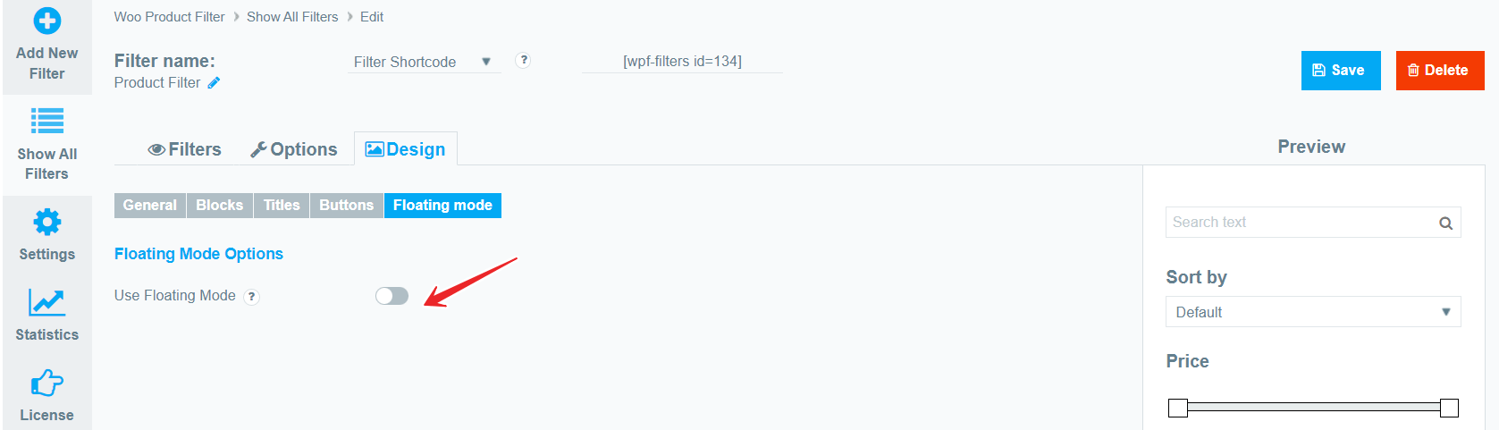
Now that Floating Mode is enabled, you can customize each element of the popup, its behavior, the popup call button, and more.
Devices
- Devices. When you have checked the Use Floating Mode checkbox, select which devices to use the filter in the popup. (All devices; Only Mobile; Only Desktop)
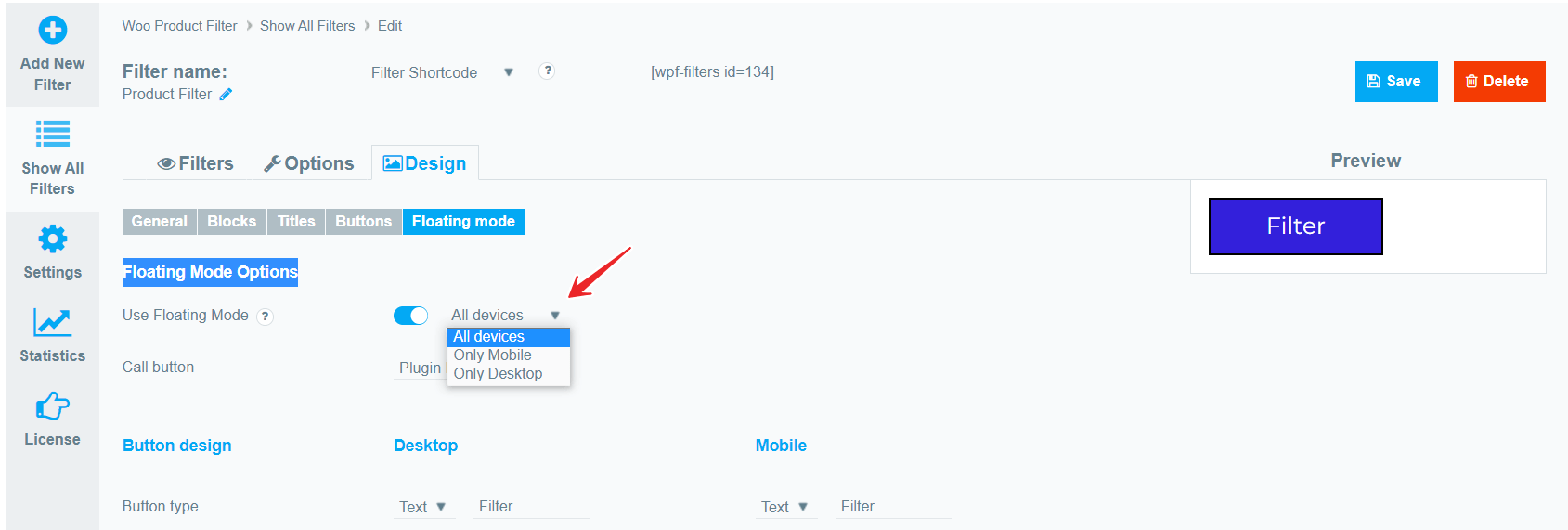
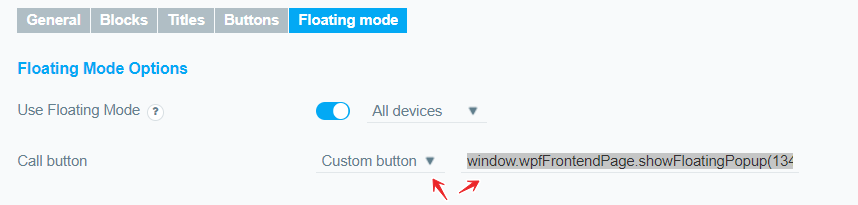
Call Button
Here you can choose “What” to use to call the filter: either a standard button from the plugin or any event on the page (Custom button).

Plugin Button:
If you have selected “Plugin Button” as the filter call, then you can fully customize its appearance on a per-device basis:
- Button type. You can choose a classic button with text and enter text for it, or upload your own custom icon.
- Fixed/Float. If the “Fixed” button is selected, the button will be positioned exactly where the filter is located. If “Floating” is selected, then the button will be placed on top of all page elements at the specified coordinates (top; bottom; left; right).
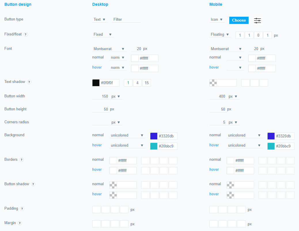
And also Font; Text shadow; Button width; Button height; Corner radius; Background; Borders; Button shadow; Padding; Margin per device, both mobile and desktop.
Custom Button:
!Choose only if you have minimal programming knowledge.
You can use absolutely any element on the page to call the filter. To do this, switch the Call Button option to Custom Button.
Next, you need to write a small JS code construct: Specify the element class that should act as a filter call, then specify an event such as a mouse click, etc., and specify a code snippet as the result to be copied from the Custom Button option.
Paste the resulting code into any JS fragment happening on the page, or into the editor built into the JS plugin.
For example, we want the filter to be called using a regular button added to the page on mouse click.
So our code will look like this:
jQuery('.wp-block-button__link').on('click', function() {

window.wpfFrontendPage.showFloatingPopup(134);

});
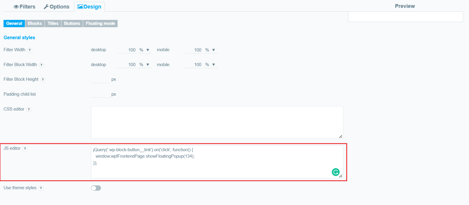
Now we will leave this code in the JS editor, and the popup filter will be called using this custom button
Note. But the filter itself should still be added to the page, in any way convenient for you (using a shortcode, or a widget).
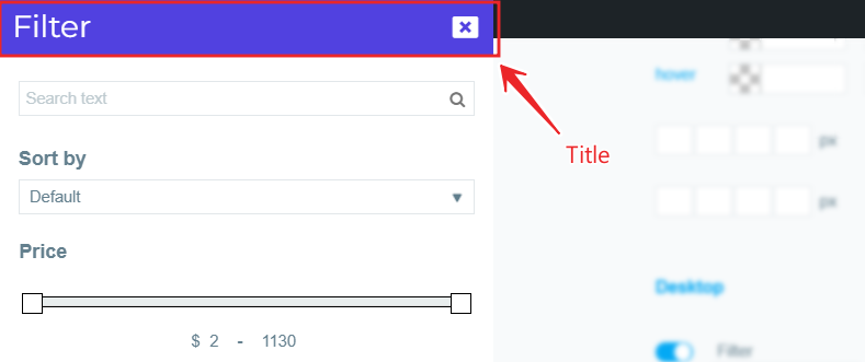
Title Design
Now let’s move on to customizing the appearance of the pop-up itself. A popup consists of the popup area + title + filter. ( All filter appearance settings are taken from the filter settings)
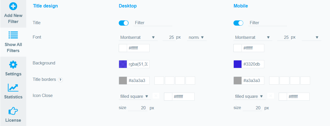
Here you can fully configure (for each device separately):
- Enable title and specify title text. If the title is enabled. then it will be fixed.
- Font, size font, style font, and color font.
- Background.
- Borders. Set borders width in this order: color, top, right, bottom, left.
- Icon Close. Choose an icon to close the popup, as well as its color and size.
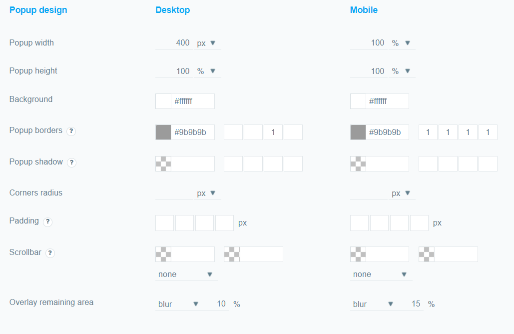
Popup Design
And now we can customize the appearance of the popup area where the filter will be placed. Here we can fully customize:
- Popup Width and Height. Initially, the size of the popup will be determined automatically based on the size of the filter, but you can set a custom popup size in percentages or pixels.
- Background.
- Popup borders. Set borders width in this order: color, top, right, bottom, left.
- Popup shadow. Set popup shadow in this order: color, X, Y, blur, spread (px).
- Corners radius. Set the rounding of the corners of the popup area in pixels or percentages.
- Padding. Set paddings in this order: top, right, bottom, left.
- Scrollbar. Set scrollbar property in this order: thumb color, track color and width. And also you can choose the type of scrollbar or disable it altogether.
- Overlay remaining area. You can control the visible area of the rest of the page when the popup is open. For example, you can blur it, darken it.
Animation settings
And finally, let’s set up the behavior of the popup and its animation.
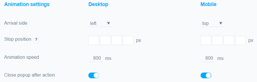
- Arrival side.
Specify where exactly the filter will appear after clicking on the button. (Left; Right; Top; Bottom)
- Stop position. Set popup stop position in this order: top, right, bottom, left.
- Animation speed. Set the filter’s appearance rate in ms.
- Close popup after action. Specify whether the popup will close when the user selects a filtering option (for autofiltering) or when they click the filter/clear button.
Still, have questions? Read our detailed documentation or Contact us and we will be happy to help you.