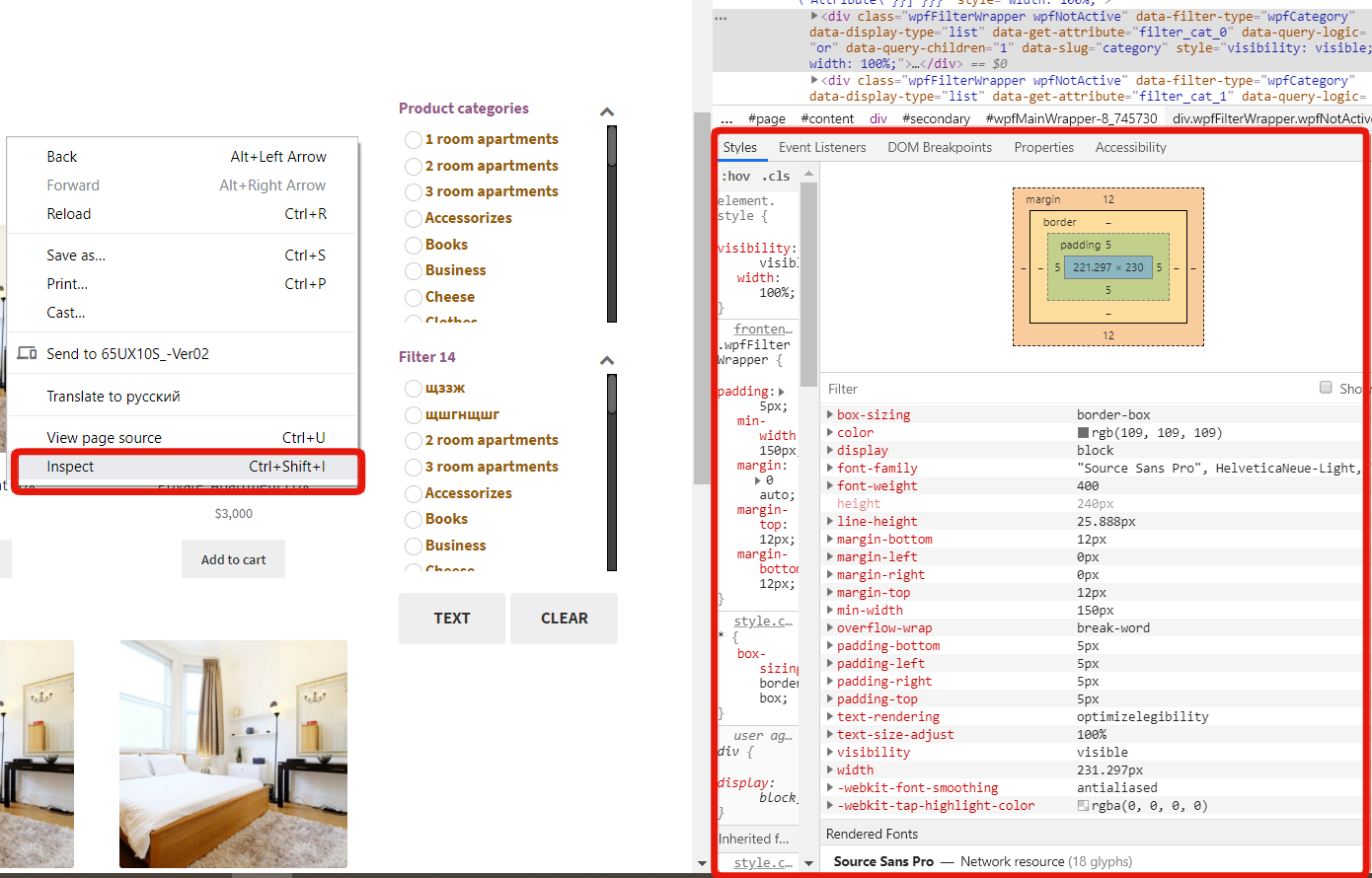
To change and customize the filter styles, go to Design -> General -> CSS Editor

- To change fonts, font size and weight of filter blocks:
.wfpTitle {font-weight: normal; font-size:20px !important;}

.wpfValue {font-size:16px; font-family: "Source Sans Pro"; !important;}
The “Title” is a title of every block, “Value” is a block.
Here you can put:
font-weight: normal/bold;

font-size:XXpx;

font-family: "Arial"; or other font family

background-color: #xxxxxx;

color:#xxxxxx
and other parameters from Styles if you tap right click -> Inspect:
- To change the on-hover colour of the select options in the filter
.wpfCheckboxHier option[selected] { background-color: orange; }
- In order to change checkboxes style:
.wpfFilterWrapper .wpfCheckbox label::before {

background-color: rgb(255, 255, 255) !important;

border: 1px solid rgb(204, 204, 204) !important;

color: rgb(68, 68, 68) !important;

}
- To align checkbox and the label:
.wpfFilterWrapper .wpfCheckbox label {margin: -10px 0px 0px 0px;}
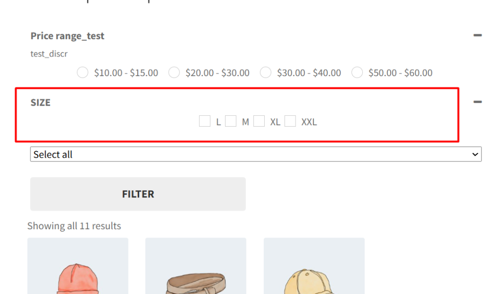
- To make checkboxes (squares) for all filters if one of them is radio buttons (circles) :
.wpfFilterContent .wpfCheckboxHier input,
.wpfFilterWrapper[data-filter-type="wpfCategory"] .wpfCheckbox label:before {
border-radius: 0 !important;
width: 18px !important;
height: 18px !important;
} - To change the button (CLEAR/FILTER) style
.wpfButton {

background-color: blue;

}
- To change the text for Search bar (JS editor)
jQuery('.wpfSingleInputSearch input').attr('placeholder', 'my text');
- To change the size and colour for “+” in collapsible categories:
.wpfFilterWrapper .wpfCollapsible {

font-size: 30px;

color: black;

}
- To center the “Attribute” filter on the screen
.wpfFilterVerScroll {

display: flex;

justify-content: center;

align-items: center;

}
Customizing the design of your product filters with CSS gives you full control over their appearance, ensuring they blend seamlessly with your website’s style. With CSS, you can modify colors, spacing, fonts, and even create interactive effects to enhance the user experience. This guide will walk you through the steps to configure and apply custom CSS to the Product Filter WBW plugin.
How to change the design of filters individually, if there are several of them, read here: https://woobewoo.com/documentation/product-filter-design-modification-guide-css/
Still have questions? Read our detailed documentation or Contact us and we will be happy to help you