Create and customize filters for your online store using the free WooCommerce Product Filter WordPress plugin.
This is an ideal way to make the purchase process really simple and enjoyable for users of your site without any special coding knowledge.
In this documentation, we will explain how to customize filter elements to match your design and enhance the user experience.
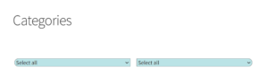
How to change the design of filters individually when there are several of them
If there are multiple filters on the site and you want to change the design of a specific one, append the ID of that filter to the CSS code.
Read How to Configure CS for Product Filter here: https://woobewoo.com/documentation/how-to-configure-css/
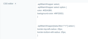
Adding styles for the id=11 filter:
.wpfMainWrapper select,

.wpfMainWrapper select option {

color: #0DA3B0;

background-color: #9FDDE2;

}
.wpfMainWrapper[data-filter=11] select {

border-top-left-radius: 25px;

border-bottom-left-radius: 25px;

}
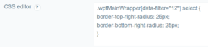
Adding styles for the id=12 filter:
.wpfMainWrapper[data-filter=12] select {

border-top-right-radius: 25px;

border-bottom-right-radius: 25px;

}
Explanation of the Code
-
- .wpfMainWrapper select, .wpfMainWrapper select option : This style applies to all
selectelements and their options within the.wpfMainWrappercontainer, setting the text color and background color. - .wpfMainWrapper[data-filter=11] select: This style applies only to the filter with ID 11, adding a border radius to the top-left and bottom-left corners.
- .wpfMainWrapper[data-filter=12] select: This style applies only to the filter with ID 12, adding a border radius to the top-right and bottom-right corners.
- .wpfMainWrapper select, .wpfMainWrapper select option : This style applies to all
Conclusion
Following these steps, you can easily change the filter design and customize styles for specific filters.
Still have questions? Read our detailed documentation or Contact us and we will be happy to help you