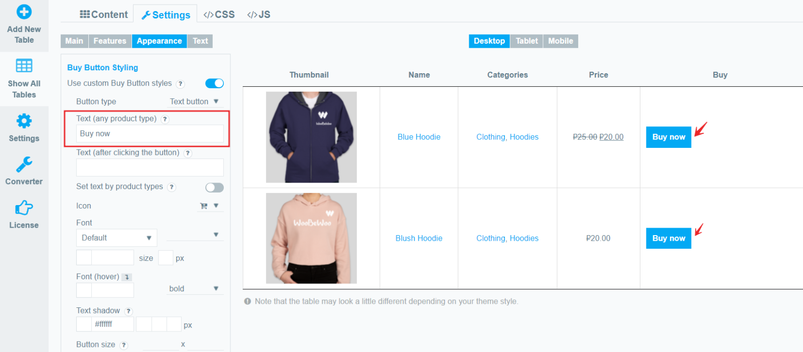
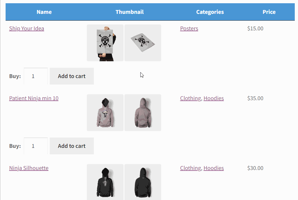
To customize the Buy button Styling, please move to the Settings > Appearance. (column “Buy” must be added)
Choose your custom styles for button Add to cart. Any settings you leave blank will default.

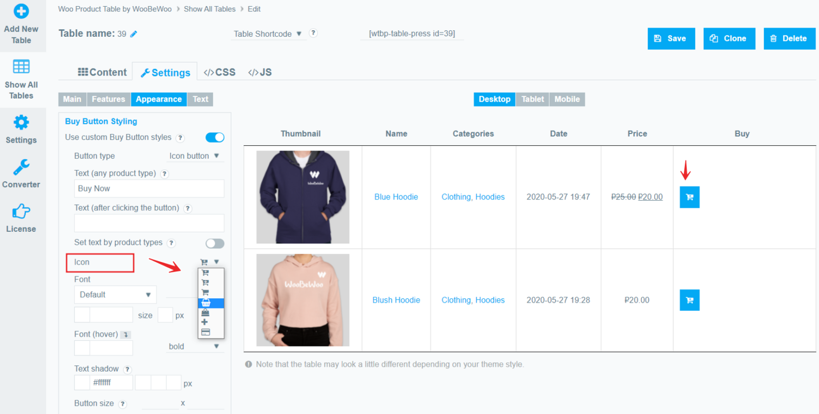
- Button type. First, let’s choose the type of button display: text or icon.
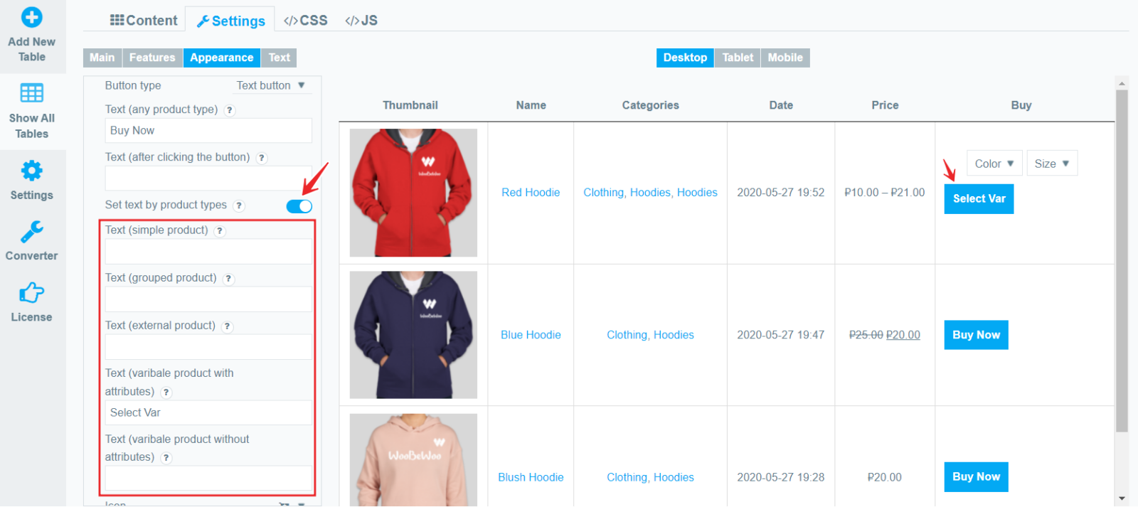
- Text(any product type). Here you can set the default button text for all product types.
- Text (after clicking the button). Here you can set the text of the button to be displayed after it is activated, for all product types.
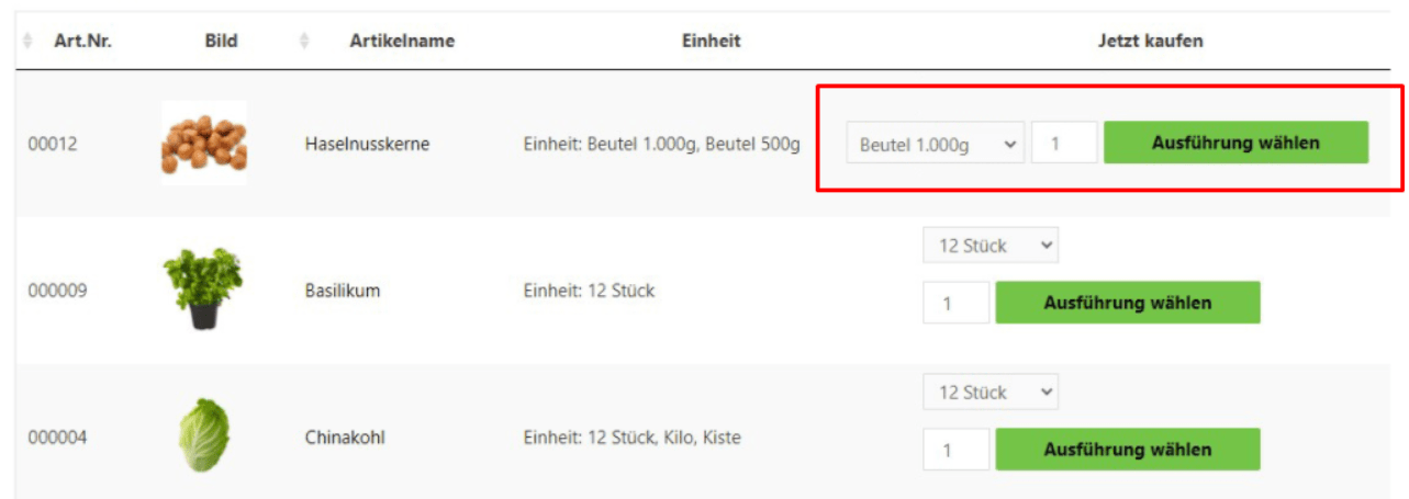
- Set text by product types. As you know, Woocommerce has different types of products, but in the Product Table, you can set the text for each type of product. Check this option and enter text on the relevant product type.
- Icon. If you select the icon type for the Buy button, you can choose an icon from the list.
- Font. Here you can choose the font, its size, color, shadow, and style.
(* If “icon” was selected as the button type, then the internal image of the icon will change)
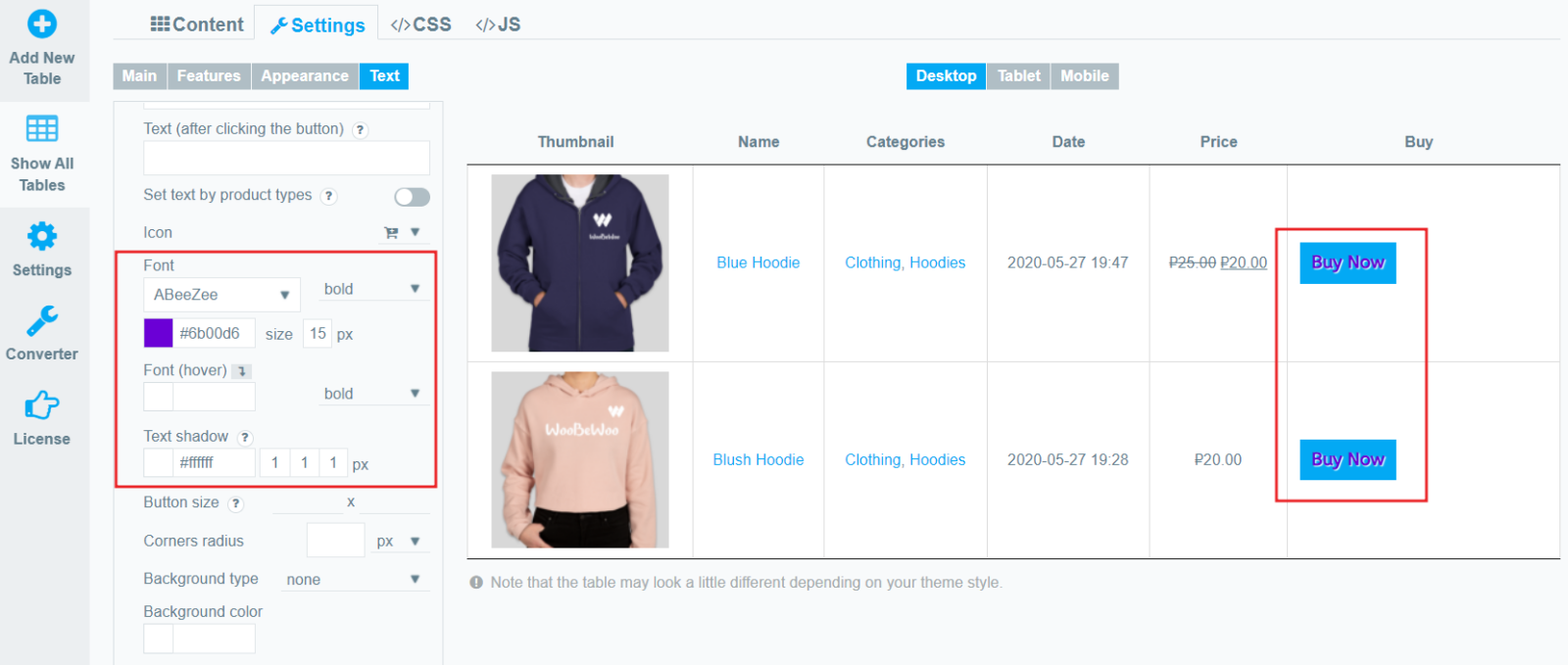
- Font(hover). Set the color and style of the text that will be displayed when hovering over the button.
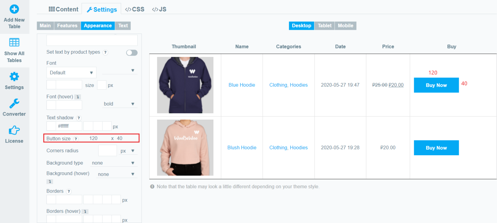
- Button size – set width and height values in pixels (in that order).
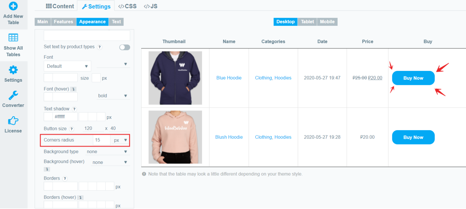
- Corners radius. Here you can specify the rounding of the corners of the button, in px or in %.
- Background type – select the type of button you prefer from the list:
- none
- unicolored
- bicolored
- simple gradient
- pyramid gradient
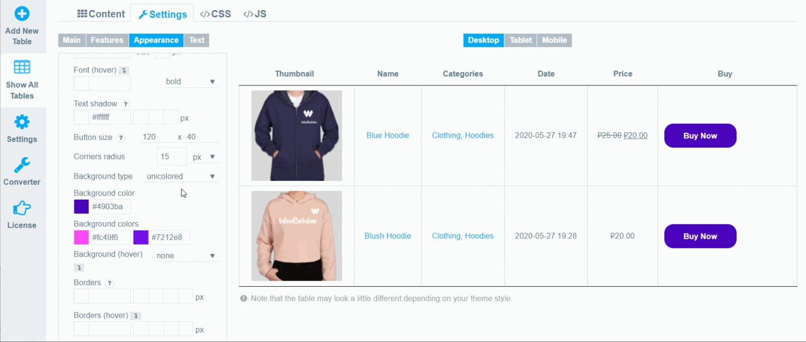
- Background Color. Select a color for the button background.
- Background Colors. If not Unicolored is selected, then here you can select additional gradient colors.
- Background (hover). In the same way, you can choose the type and colors for the button when the cursor is hovered over it.
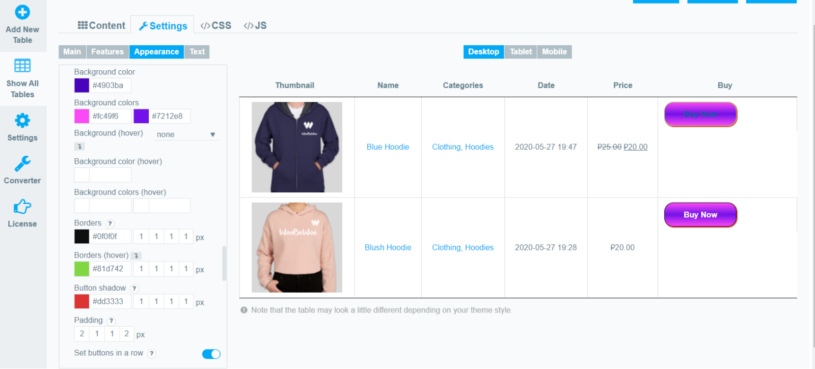
- Borders. Set button Borders in this order: color, top, right, bottom, left.
- Borders (hover). Set button Borders in this order: color, top, right, bottom, left. (when the cursor is hovered over it.)
- Button shadow. Set button shadow in this order: color, X, Y, blur, spread.
- Padding – set the padding for button content in this order: top, right, bottom, left.
- Set buttons in a row. Set the position of buttons for custom style. If enabled, this will align all buttons in one row. It can be very useful when a button with variations moves to the side in relation to others.
View Cart Button Design
Under the Buy Button Styling section, there are also settings for the View Cart button.
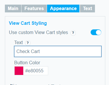
Toggle the corresponding option to change the text and color of the button.
Still, have questions? Read our detailed documentation or Contact us and we will be happy to help you.