Mobile Visibility
The WooCommerce Product Table comes with several options for controlling the behavior of tables on screens of different sizes, such as on mobile devices and tablets.You can easily choose between display modes on gadget screens. And also choose the width of the screen to hide the columns.
Responsive Design
Responsive design is the practice of designing a table so that it looks and works correctly on various devices – in particular, on mobile phones and tablets, as well as on desktop computers and laptops. WooCommerce spreadsheets are fully responsive and look great on any device.
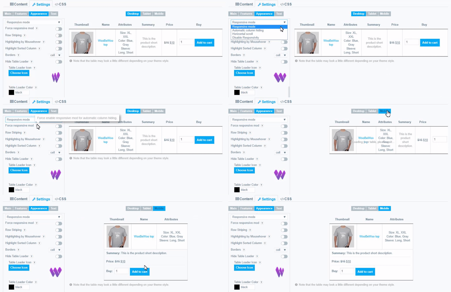
The plugin provides 4 different modes of Responsive Design according to your needs:
- Responsive Mode
In this mode, if table content doesn’t fit all columns become under each other with one cell per row.

If this mode is selected you can configure the “Hide child action” option. Set behavior for hide responsive child columns: First column click;Additional table column click; Disable hide child behavior.
![]()
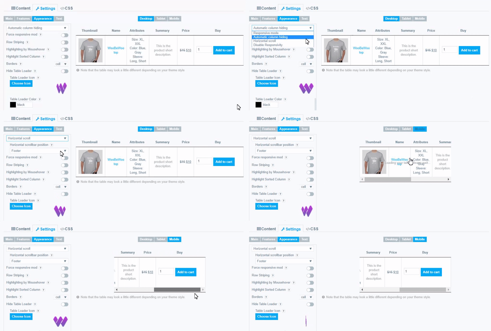
- Automatic Column Hiding
In this mode, table columns will collapse from right to left to parent container width.

- Horizontal scroll
In this mode, the scroll bar will be added if the table overflows parent container width. You can change the horizontal scrollbar position – display it in header, footer or both.

If this is selected you can select the position of the scrollbar: Footer; Header ;Footer and Header.
- Disable Responsivity
Disable Responsivity – default table layout.
Here you can look at the examples of product tables which has been built using WooCommerce Tables by Woobewoo.
- Force responsive mod. Force enable responsive mod for automatic column hiding.
Responsive mod Thumnbnail Size
You can also set the thumnbnail size while in responsive mode.
To do this, open the Thumbnail column settings and in the Responsive mod thumnbnail size field, set the value you need.( by default 150×150)
![]()
Can I hide the column for small screens?
Yes! You can enable “Hide / Show on Small Screens” if you want to hide this column. Just click on the “pencil” and adjust the visibility of each column on small screens.
![]()
Screen size that you can set on the Appearance tab Select the screen width to hide the columns.
![]()
Our WooCommerce Product Table plugin is as adaptive as possible to any devices. User-friendly interface and stylish design for you and your customers
Still have some questions about Woo Product Table on mobile screen? Contact us and ask about it.