In today’s fast-paced digital world, the majority of online shopping happens on mobile devices. That’s why delivering a smooth and intuitive mobile experience is no longer optional, it’s essential.
One of the most common reasons mobile shoppers abandon a search is poor filtering. If users can’t easily find or adjust filters, they quickly lose patience and leave. Effective product filtering plays a critical role in helping customers discover the right products faster and with less frustration.
Let’s explore the most common mobile filtering challenges, and how to fix them to improve user experience and conversions.
Overloaded Mobile Filtering Menus
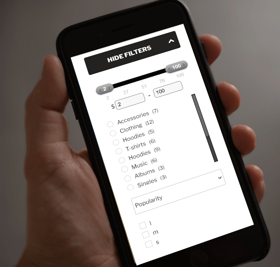
On most responsive websites, product filters appear as a dropdown menu on mobile devices. While this saves space, it can easily become overwhelming when too many filtering options are displayed at once.
With the WooCommerce Product Filter plugin, you can add a Hide Filters button that automatically hides filters when the screen resolution changes. This keeps the interface clean and prevents clutter on smaller screens.
If your store requires many filtering options, a smart approach is to create separate filter layouts for mobile and desktop. Since mobile screens can’t display all filters at once, users are often forced to scroll excessively. Adjusting font sizes, spacing, and button dimensions can make filters easier to scan and interact with.
The Product Filter plugin allows you to hide or show specific filters per device, making it easy to tailor the filtering experience for mobile users without compromising functionality.
 Important Filters Are Hard to Find
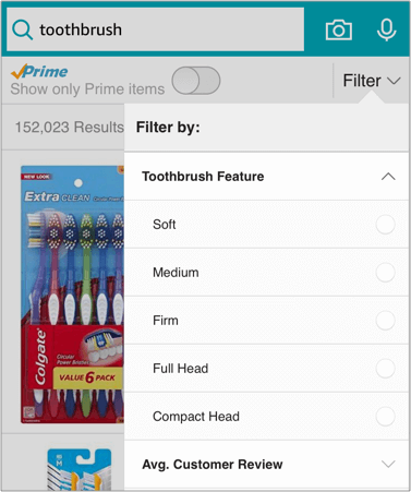
A common usability issue is that the most useful filters are buried at the bottom of a long list. On mobile, users tend to interact mainly with filters placed at the top, while hidden or hard-to-reach filters are often ignored.
This can interrupt the customer’s journey, even if they’re close to finding the right product.
To solve this, the WooCommerce Product Filter plugin lets you place filters inside collapsible (close) dropdowns. This way, essential filters stay visible, while secondary ones are hidden but still accessible when needed, keeping the interface clean and discoverable. 
Keep Filters Visible and Easy to Change
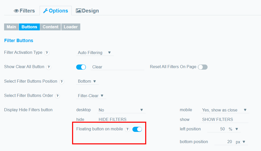
Making the filtering menu floating would help customers to access it at any point in their journey. This can save them the hassle of scrolling to the top of the page to double-check what they’re filtering by or to add or remove any other filters.
That can be easily implemented with the Product Filter plugin. Go to the settings page, enable the Hide Filter option and turn on the Floating Button. You can find out more from the detailed documentation.
For a smoother mobile experience, combining smart filters with clean image filenames, using tools like the File Renaming on Upload for WordPress plugin, along with intuitive navigation can significantly improve overall usability and SEO.
Show Only Relevant Filters on Mobile
Because mobile screens offer limited space, it’s best to display only filters that are relevant to the current product category. If a filter doesn’t apply, it shouldn’t appear at all.
The Product Filter plugin allows you to control filter visibility at the individual filter level. By hiding less important filters on mobile, you help users focus on what actually matters, resulting in faster searches and better decision-making.
The Bottom Line
Ignoring how filters behave on mobile devices is a costly mistake. While filters may seem like a small detail, they play a major role in whether users stay or leave your store.
Many customers shop exclusively on their phones. If mobile filters are confusing, cluttered, or hard to use, visitors won’t switch to desktop, they’ll simply abandon the site.
Well-designed filters create a seamless shopping experience. And with the WooCommerce Product Filter plugin, you can fully customize filtering behavior for both mobile and desktop, ensuring your store performs flawlessly on every device.
