In order to customize the table functionality and design, open the “Settings” tab which includes:
Main Tab
In this tab, you can set the Table elements
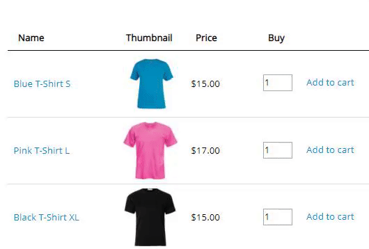
Caption. Check if you want to show the name of the table above the table.

Description. You can add a short description to the table between title and table.
Signature. You can add a signature under table footer.
Header. Check if you want to show the table head.

Footer. Check if you want to show the table footer.

Fixed Header allows fixing the table’s header during table scrolling. You can also set the Top margin which is extremely useful if a page with a table already has some fixed elements like a fixed menu etc.
Important! Header option must be enabled for using this feature.
Date Formats

Date. Let output format for the date. For example: y-m-d- 1991-12-25, d.m.y – 25.12.1991
Time / Duration. Set output format for time and duration. For example: 1) time – H:m – 18:00, h:m a – 9:00 pm 2) duration h:m – 36:40, h:m:s – 36
Features
Here you can activate additional functions to work with the table:
Table information. Show pagination information after the table.

Sorting. Allow dynamic sorting with arrows. To use this option you must enable the Header option.
You have an option to select the column to sort by default. Works only with relevant columns enabled.
Sorting descending. The default is the 1st column and “Ascending” order for the sorting. Enable the checkbox if you want to sort by descending.
Sorting type. Toggle the option if you want to sort the products in the admin table preview to the frontend. To set the custom sorting, move to the Content tab, add the products to the table, and locate them in the exact order you need:

Moreover, you can set the order for the product manually. You can easily replace the item to the necessary position. It is a more convenient way if the table contains a big number of products. Also, this is the only way to move the product to the next or previous page due to pagination.
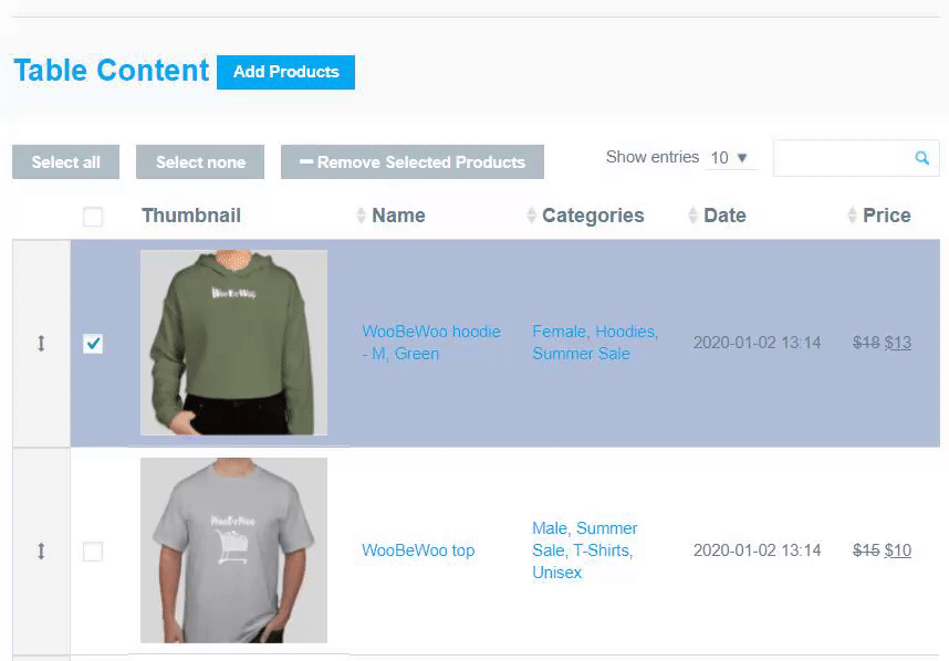
The order will be saved in the way you set it and will display in a table.
Pagination. Show table pagination.

If Pagination menu is enabled, in Pagination list content you can set the number of rows to display on one Pagination page. Establish several numbers separated by a comma to let users choose it personally. The first number will be displayed by default. Since that the number of Pagination Pages will be recounted also.
Toggle the Scroll to top on pagination option to scroll the page to the top when pagination is used.
Server-side Processing – this option is recommended for large tables that cannot be processed in a conventional way. The table will be sequentially loaded by ajax
on a per-page basis, all filtering, ordering and search clauses is server-side implemented too.
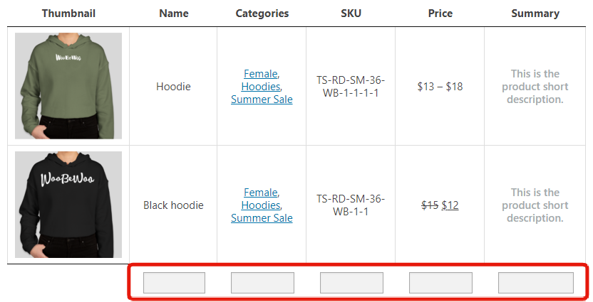
Searching. Enable to add an instant search by keywords.
Search by Columns. Add search by table columns. Use a semicolon as a separator to select any of the values.
Search by letter. Show alphabet for search by the first letter.
Print. Print the product data straight away from the table in one click.

Also, you can save your table as PDF file by choosing to save as pdf at the new window in destination settings.

Print Logo. If the option is one, the website logo will be also printed.
Print captions. If enabled, you can print the table caption, description and signature.

Hide the out of stock items helps you to hide all of the products that ended.

Show private products feature needs to display products on the front-end.

Show message after put product to cart – enable the option to show a message in a popup after putting the product in the cart.
Popup position – set the position of the adding to cart notification.
Show variation description instead of product description – toggle the option to show variation description instead of product description in variations popup.
Show variation thumbnails – if you have different pictures for a variable product, the thumbnail will be changed that the user selects the variation.
Show the first variation as default – preselection of variation for variable products instead of the name of an attribute.
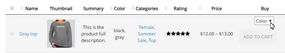
Show variation price in price column – the price of selected variation will be in the Price column instead of the price range + price of the selected variation in Buy column.
Add all to cart feature allows you to add all current products on the table to the cart.

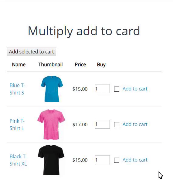
Add selected to cart allows your customers to select a number of necessary products and add everything to the cart in one go.
Min/Max bunch add to cart – turn on the option to eat the Set min and max quantity values for the “Add selected to cart” and “Add all to cart” buttons in the corresponding numeric field.
Hide view cart link – you can hide a link “view cart” after customer added a product to the cart if you need.
Lazy load – is the option suitable for a large table. You can set the number of rows to display on one lazy load in the Lazy load limit numeric field.
Hide quantity input feature allows you to hide quantity input for add to cart button in the frontend.
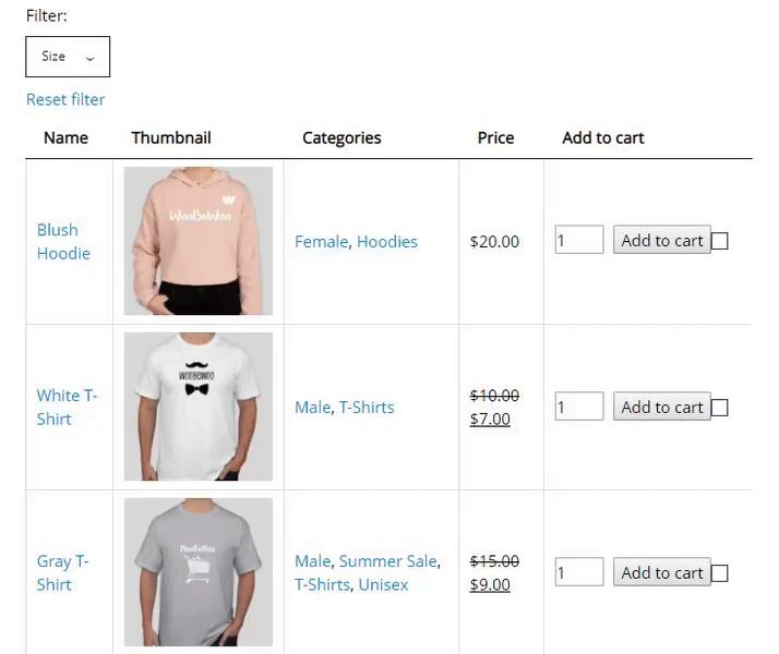
- Attribute filter – enable attribute filter and select attributes to filtering.
Hide searching attributes from a table – if you have too many attributes or don’t want to show them in a table, you can hide them using this option, but still using filter to search by.
Attention: you don’t need to add attributes as a column to make filters available. Selected filters will be displayed. If you will add some attribute as a column manually, it will not be hidden even is “Hide searching attributes from a table” is enabled.
Attribute filter title. Set it if you want to replace titles for all filtered attributes.
Select attributes. Select attributes to filtering.
Show as. From this dropdown, you can select how to display the filters: dropdown or multiple dropdowns.
Search for a specific attribute – Results includes all products where the attribute exactly matches the search criteria, f.e:

Logic. Set the logic for showcasing OR or AND.
Custom order for terms. Enable the option to sort attribute terms by Woocommerce custom sorting.
- Tags filter. To filter the products in the table by tags, toggle the Tags filter button. It works only with enabled tags columns.Tags filter title. It displays the default title in the dropdown tags filter.Hide tags from table. The option allows hiding tags column and keeping the filter to display. You don’t need to add Tags as a column to make the filter available. If you will add Tags as a column manually, it will not be hidden even if “Hide tags from table” is enabled.Show as. From this dropdown, you can select how to display the filters: dropdown or multiple dropdowns.Logic. Set the logic for showcasing OR or AND.

 Use only some tags. Toggle the option to specify which tags to show.
 Select tags. Select the tags from the dropdown.
- Custom taxonomy filter feature allows you to categorize information based on different attributes.

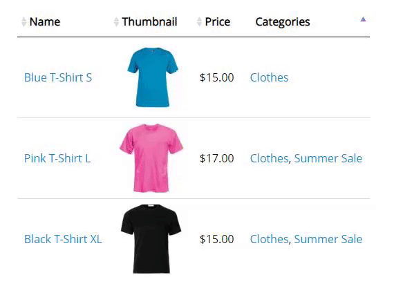
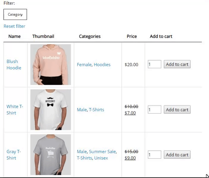
- Category filter. Enable category filter and filtering by categories of product.
Filter category title. It displays the default title in the dropdown category filter.
Hide searching category from a table – if you don’t want to show them in a table, you can hide categories column using this option, but still using the filter to search by.
Attention: you don’t need to add the category as a column to make filters available. Selected filters will be displayed. If you will add the category as a column manually, it will not be hidden even is “Hide searching category from a table” is enabled.
Show as multiple drop-down or drop-down with a single select.
Inner table filter. Apply filter by category after clicking the category link in a table column.
Logic. Set the logic for showcasing OR or AND.
Use only some categories. Enable the option to show in the filter only selected categories.
Select categories. Select categories to filter.
Include children. Toggle the option to include the child categories.
Use as main filter. Turn on if you want the category filter to dynamically affect the content of attribute filters.
Also, WooCommerce Product Table plugin will display the hierarchy of categories in the dropdown list.

- Price filter works only with enabled price column.
Show as multiple drop-down or drop-down with a single select.
Filter price title. It displays the default title in the dropdown price filter.
Show as. From this dropdown, you can select how to display the filters: dropdown or multiple dropdowns.
 Set range – for manually settings press the “Setup” button and customize your price range settings. You may increase or decrease the number of steps and set different values for each step. Also, you can set the minimum and maximum price.
Step. Here you may set the value of the prise increase step. The default value is set to 20. All the steps are equal. When setting the step, please note that the number of elements in the list should not exceed 100, otherwise the step setting will be reset and automatically calculated.
Set the min/max price in the corresponding field.
Click the blue Setup range button to open the window for setting up the range manually.
Hide products before filtering. Turn on the option to hide all the products in the table until a user defines a search parameter or filter.
Appearance
Here you can choose a visual style of the table.
- Set the fixed table width in PX or %.
- Select the thumbnail size to display in the interface.

- Mobile screen width. Select screen width to hide columns. You can set which columns should be hidden on the Content tab in the column options.
- Hide child action. Set behavior for hiding responsive child columns. Select First column click, Additional table column click, Disable hide child behavior.
- Force responsive mod. Force enable responsive mod for automatic column hiding.
- Manage width to hide columns on the mobile screens and set which columns should be hidden on the Content tab in the column options:

Choose a Responsive Mode for a table. WooCommerce Tables are fully responsive and provide 4 different modes of Responsive design according to your needs: standard, automatic column hiding, horizontal scroll, and disabled responsivity.

- Borders. Cell – adds border around all four sides of each cell, Row – adds border only over and under each row. (i.e. only for the rows).
- Add borders. Cell – adds a border around all four sides of each cell, Row – adds a border only over and under each row. (i.e. only for the rows), None.

- Row Striping – add an automatic highlight for table odd rows. For example – you use a table, but the table’s rows are difficult to separate visually, especially when there are many columns (or multiple lines to a row) – add row striping to a table, it will display rows background in two similar shades of colour to alternately.

- Use highlighting by Mouse-hover to add row highlighting on mouseover and make browsing of the table more convenient.
- Highlight Sorted Column – check and the currently sorted column will be highlighted.
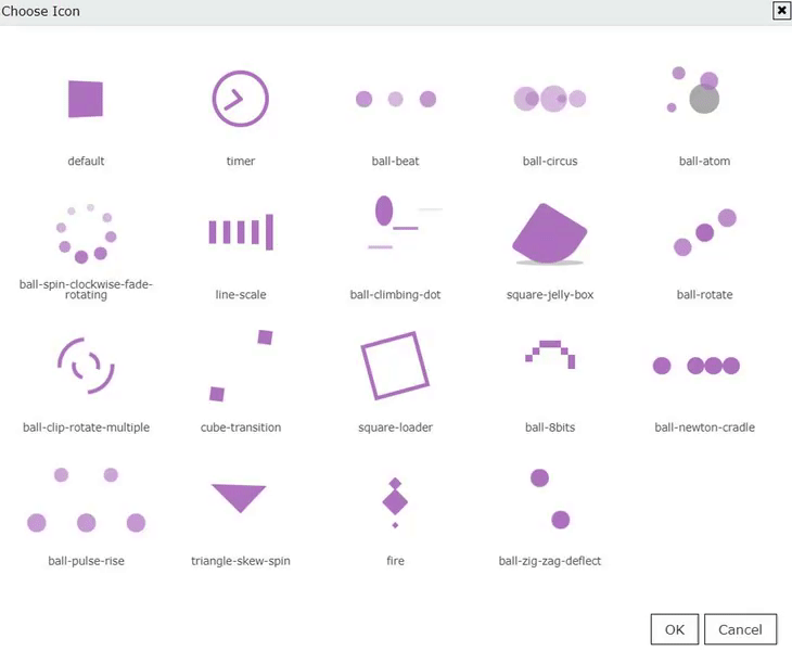
- Enable/disable table loader icon before the table will be completely loaded.
- Choose a table Loader Icon and colour.
Custom table styling (pro)
Choose your custom table styles below. Any settings you leave blank will default to your theme styles.
Borders external. Set the border colour and width in px:

Borders header. Set the colour and width for a header. These settings apply to a header, footer and “search by columns” field.

Borders rows 
Borders columns

Header background. These settings apply to a header, footer and “search by columns” field.

Header Font. Select the font for a header (the same for a footer), font size and colour:

Cell background 
Cell font. Select the font for cells, font size and colour:

Search Bar Colors. Here you are able to set the colour of background, font and border:

Fixed Layout – set all columns of the same width.
Vertical alignment – set the vertical alignment of table cell contents.
Horizontal alignment – set the horizontal alignment of table cell contents.
Pagination Position – set pagination buttons position, left, centre, right.
Important! After you changed the settings of plugin don’t forget to click the “Save” button.
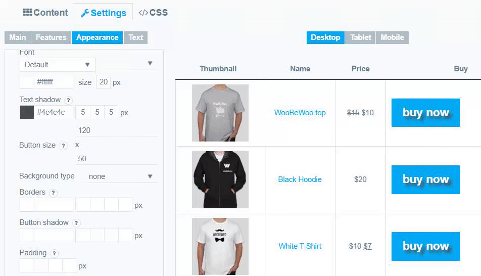
Buy Button Styling
Choose your custom styles for button Add to cart. Any settings you leave blank will default.
Button type – text or icon.
If you select the “text” -you can overwrite the default button name, choose font and font size and colour, text-shadow (order: colour, X, Y, blur)

Or select the icon for the button. The same settings are available for an icon – icon size, colour, text-shadow.

Button size – set width and height values in pixels (in that order).

Background type – select the type of button you prefer from the list:
- none
- unicolored
- bicoloured
- simple gradient
- pyramid gradient
Borders – set button Borders in this order: colour, top, right, bottom, left.
Button shadow – set button shadow in this order: colour, X, Y, blur, spread.
Padding – set the padding for button content in this order: top, right, bottom, left.

View Cart Button Styling
Under the Buy Button Styling section, there are also settings for the View Cart button.

Toggle the corresponding option to change the text and color of the button.

Language and text

Overwrite Table Text.
Here you can change the settings of service text in your table:
- Add selected to cart button text – set the text that your users will see when you enable a “Add selected to cart” option.
- Add all to cart button text – the sample text a user sees when “Add all to cart” option is on.
- Add variation to cart button text – the text you’ll see when adding the variation to the cart.
- Empty table – set the text that your users will see if the table has no data.
- Table info text – the text that users will see in the left bottom corner under your table if pagination is enabled.
- Empty info text – set the text that users will see in the left bottom corner under your table if it is empty (pagination should be enabled).
- Filtered info text – set the text for filtering.
- Length text – the text that users will see in the left top corner above your table if pagination is enabled.
- Search label – rename the label for searching on your own taste.
- Zero records – input the text for users, if no matching data were found during their search
- Filer text – set the text that users will see before the filter dropdown
- Reset text – input the text for the Reset icon is you using the filters.
- Stock quantity items text – the sample text for tock quantity.
- Select attributes text – the string a user sees if not selecting the attributes.
- Product added to cart button text (MPC) – the notification after adding the product to the cart.
- Product not added to cart button text (MPC) – a text you’ll when a product isn’t added to the cart.
- Replacing the text “out of stock” – a sample text for out of stock.
CSS editor
Here you can add custom CSS for the current Table.
Preview
After you change some settings – with responsive data tables plugin, you can immediately see the result – open the “Preview” tab and check the table. Note that the table may have minor changes depending on the style that your theme has.